"That's a lot of damage"
Design debt is a widely spoken topic in the design community but there are often more pressing issues in start-ups such as Renovation Man.
So let me be straight to the point: back in 2019, we had another intertwined debt issue... Although, the design debt we inherited was obvious and latent, there was a much bigger elephant in the room (shall I say mammoth?) : technical debt. A biggie (serious thing I told you... designer presses alt-F4 and never comes back).
When our developers looked at it, their despaired faces went like:

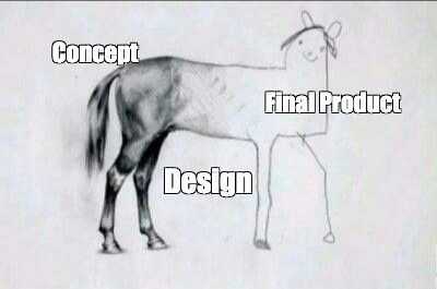
Our actual lead dev (untrue)
Yet, we were (and still are! -that's for the PR-) a fresh squad of ambitious tech-product lads: we sought to start clean. We took our role of Schumpeter's envoys of creative destruction very seriously : we bombed it all. Boom! Kbai la "dette technique"! See you never.
You can learn more about this story here (the narrator will be Alex, our CTO, and you won't find much of this designer chit-chats and nonsensical words; get your javascript skills in order though. You're warned kids!).

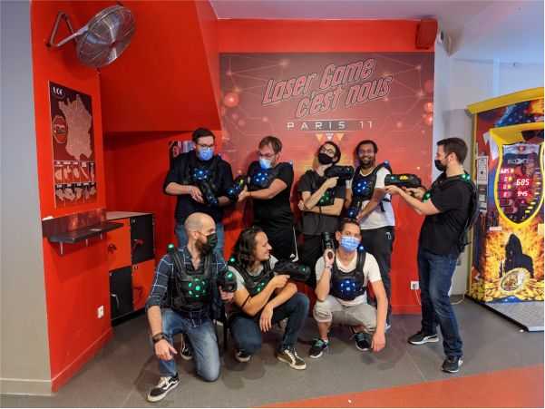
Our squad including our new mercenaries recruits. Hashtag "Team work as usual..."
In a nutshell, it was a long fought battle. Throughout a year, we faced countless challenges. Eventually we made it (supriiiise!). So, we came out clean, brand new and ready to tackle our oncoming challenges with high hopes for the future of our 3 products (now we got 4!).
We didn't quite know yet, that another variant of debt-19 was rising throughout the shadow: debt-20. This time, it was we who birthed it, and it was widely design centric.
Guilty of Design
When you're the only designer in your company, there's often a time when you start to realize that every single design decision that you take increases the design debt of your product. Whether this is a good or a bad thing is often controversial amongst the design community. So let's talk about it, a little (not so) seriously.

Design for dummies (3secs crash course)
Not so surprisingly, this questioning struck the narrator-designer in full force (that's me!). So did I seek comfort in the advices of my senior peers: "Senior Product Designers with so much lordly seniority, I've got consistency issues but I don't want to compromise our ability to do agile design, what should I do?" did I shout out in the open of Twitter's sacred shadowlands.
"Seek the design system...Your answers lie within" they answered in a rale; and they got offline. Wow! Impactful! But, that is it? I couldn't help but feel this was just some 140 280 characters half baked answer (right?)! All things unconsidered, I went like : "aight fella designer senpai, i'll look into it, for the sake of my design integrity. Yellah!"
Enter sandman Design System
As you may know, design systems were all the rage in 2020. If you're a designer, there's a great chance you've been told by fellows & peers that you should just be their benevolent and obedient servant. Questioning them? That's a no-no for the many people. The common ethos (should I say cult?) goes like : "design systems are good, if you want to scale" voilà, kbai. At least, so "they" say (you define they!).
At Renovation Man, we're a small agile squad with a strong oral and iterative culture. We often break what we build, and we're fine with it. (I suspect some liking it more than the average Joe in the team but oh wells, that's a topic for another day). It was clear we needed a little more structure though. We had to find a way to speed up design time (i'm the sole designer there, it comes with its perks...but mostly a lot of rushes and tons of things to do most of the time) and create a common language.
Disclaimer time! If you're familiar with the following situation, you're reading the right article: "Yeah mate, can you put some light-grey there? You know #ECECEC, the one we got on the input fields too, yeah, that one, ah you called it "grey-front-vortex-Z-4989-Kryptonytro"? Okay, oh well, let's find a solution". That's about how our daily conversations were like. So yeah, there was a problem.
The Lego Kit Syndrome (and how to avoid it)
Though we needed a little more structure, I did my research and found out we also wanted to avoid the LEGO kit syndrome (also known as the end of creativity and agility -hell yeah!-). There's a brilliant article that talks about this: Design system : LEGO kits syndrome by Budi Tanrim from UX Collective on Medium. It's a quick 3 mins read, have a look!

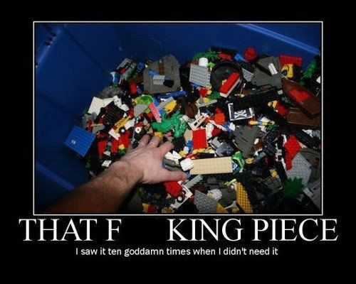
How design systems tend to feel like
But okay, you most likely won't so let me highlight the two main points for you (TL;DR, here we go!):
- "Balancing consistency and contribution should be the primary concern of design systems."
- "Without any participation and contribution from the community, it is simply a pattern library — not a design system."
Finding balance in the force our design system: did you say Design System Lite Initiative (DSLI)?
We started our journey on the trail of design-system-landia with the aforementioned design principles in mind: "if we're doing this, this isn't going to be a restrictive pattern library nor just documentation for the sake of documentation. We want this system to be useful, on a daily basis, and mostly iterative". Let me put it this way (punchline incoming...): we wanted to avoid systematic design, so we did a (light) design system. We call it the Design System Lite Initiative. Why "lite"? Because software guys don't know how to write "light" properly. Eventually, think about our DSLI being just like a compressed picture: when you're seeing a picture on your average android phone with an average screen do you need it to be 6000x6000px? It's a rhetorical question. Tip: The answer is no, non and 不對!
Eventually, we started with a simple yet thorough audit of what was pre-existing on the dev libraries and on the design side. A few co-creation sessions later we had agreed upon what I like to call a positive compromise: we were clear about things that needed to be set in stone (spoiler : fonts, text size, colors, buttons & states, drop & inner shadows, inputs fields, labels, spacings, very specific product components, and our set of emojis & icons.). The next phase was mainly focused on building the Figma file for it, insuring consistent and frequent communication, while making sure we worked as a team with appropriate synergies and timely meetings. I'll write another article that goes into the specifics of how we built it: stay tuned!.
The fellowship of the DSLI
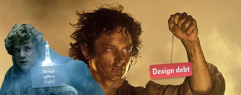
Allow me the analogy here, (no please don't leave!): building a design system in a start-up with an agile mindset centered on oral culture is much like Frodo trying to reach Mordor to destroy the one and only ring (namely, the design debt!). It's all about small, yet consistent (hairy) steps. As a designer you will of course carry the burden; yet your fellows will likely be around, battling on many fronts, ensuring that you make it. As Gandalf himself would say (a good friend of mine...): "even the littlest of man can accomplish great things, [if surrounded by the right peeps]". Sometimes, you need a little Same Wise the Brave, to give you that final boost of energy though. We're looking for him/(her) (see below). We still haven't reach Mordor for sure, but we're approaching, and many of our fellows have already pulled badass Legolas moves to make this happen; and that's what matters most.
Thanks for reading.
Frodo the Designer
PS: we're looking for another mate to join the fellowship soon, if you identify yourself as Sam Wise Gamegie, oh well, you're probably the one we're looking for. Our precious. Find more about the Renovation Man Team here.

